A client asks how their landing page looks on an iPhone. A bug report says the menu covers the price on Android. You need the picture for a ticket, a deck or a pitch, and the phone in your pocket is the wrong model, or signed in, or showing a banner you already dismissed.
You do not need the phone. A mobile screenshot of a website is the page rendered in a phone-sized browser window, and you can open that window on your computer: in a free online tool, or in the developer tools every desktop browser ships with. What is worth understanding is what "phone-sized" has to include. A site can decide what to show by the window's width, by the screen's pixel density, or by the browser it thinks it is talking to, and a screenshot that changes only one of them can show the wrong version.
Below: the quickest way, then each desktop browser with its vendor's own steps (checked November 2, 2026), then what none of them can fake.
- The quickest way: a free online tool with phone sizes
- Chrome: the device toolbar in DevTools
- Microsoft Edge: Device Emulation
- Firefox: Responsive Design Mode
- Safari on a Mac: Responsive Design Mode, then a screenshot
- On the phone itself
- Where the honest limits are
- Many pages, more devices, or the same page every day
- FAQ
The quickest way: a free online tool with phone sizes
- Open site-shot.com and paste the page's address into the box at the top.
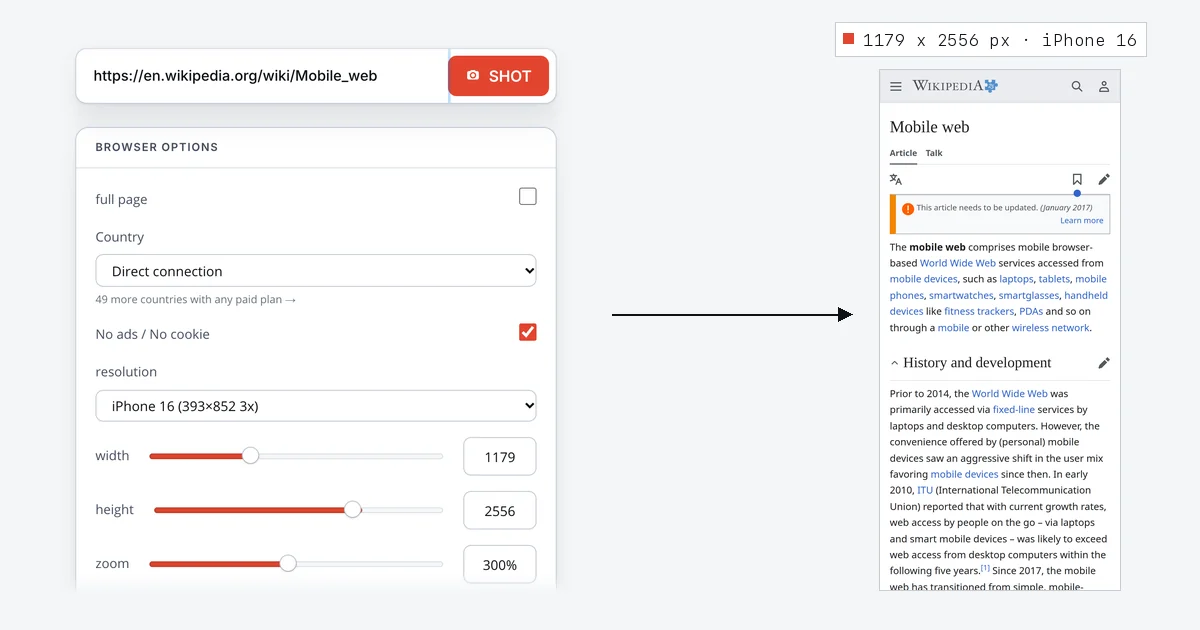
- Under Browser options, open the resolution list and pick a phone from Android Devices or iOS Devices, for example iPhone 16 (393×852 3x) or Google Pixel 9.
- Tick full page if you want the whole page rather than the first screen, then press Shot.
Choosing a phone fills in the rest. For the iPhone 16 the width becomes 1179, the height 2556 and the zoom 300%: the page is laid out in a window 393 pixels wide, which is the iPhone's width in CSS pixels, and drawn at three times that resolution. The image comes out at 1179 × 2556 pixels, the size of an iPhone 16's own screenshot.
The tool also sends the user agent of Safari on an iPhone, so a site that serves a separate mobile version to phones serves it to the capture too. Wikipedia does: the capture on the cover is its mobile skin, with the collapsible sections and the hamburger menu, not the desktop page squeezed narrow.
There is no signup, and the image is yours to download or copy. No ads / No cookie is ticked by default and hides the ad and cookie-consent elements it recognises; untick it if the banner is what you need to show.
Chrome: the device toolbar in DevTools
Chrome's device mode simulates a phone-sized viewport and can save it as an image (Chrome DevTools documentation):
- Open the page and press F12 or Ctrl+Shift+I (Command+Option+I on a Mac) to open DevTools.
- Click Toggle device toolbar, or press Ctrl+Shift+M (Command+Shift+M on a Mac).
- Choose a phone from the Dimensions list at the top of the page.
- Open More options (the three dots in the device toolbar) and choose Capture screenshot for the visible screen, or Capture a full size screenshot for the whole page.
The same menu has Show device frame, which draws the phone's outline around the viewport for the devices DevTools has artwork for. Useful for a slide, less so for a bug report.
Microsoft Edge: Device Emulation
Edge's developer tools are built on Chromium's, and Microsoft documents the same feature as Device Emulation (Microsoft Edge documentation):
- Right-click the page and choose Inspect.
- Click Toggle device emulation in the Activity Bar, or choose Customize and control DevTools (
...) > Device Emulation. - Pick a phone from the Device list.
- Choose More options > Capture screenshot, or Capture a full size screenshot for the whole page.
Microsoft's page is explicit about two settings that decide which version of a site you get. The Device Type list chooses between a mobile and a desktop viewport and between touch and click events; if it is not shown, add it with More options > Add device type. And when a page "depends on the user agent string from a mobile device to render properly", set one in the Network conditions tool: clear Use browser default, then open the menu that reads Custom and pick a mobile user agent from the predefined list.
Firefox: Responsive Design Mode
Firefox calls it Responsive Design Mode (Firefox DevTools documentation):
- Press Ctrl+Shift+M (Command+Option+M on a Mac), or choose Responsive Design Mode from the Browser Tools submenu of the Firefox menu.
- Click the device name at the top and pick a phone. Firefox sets the screen size, the device pixel ratio, touch simulation and the user agent of that device's default browser in one go.
- Click the camera button to take the screenshot. It is saved to your downloads folder, or copied to the clipboard if you turned on Screenshot to clipboard in the DevTools settings.
Because one choice changes all four settings, there is nothing else to remember.
Safari on a Mac: Responsive Design Mode, then a screenshot
- Choose Safari > Settings, open Advanced and turn on Show features for web developers. The Develop menu appears in the menu bar.
- Open the page and choose Develop > Enter Responsive Design Mode (Control+Command+R).
- Pick a viewport size preset, or click the width or height and type a size.
- Apple's documentation for Responsive Design Mode describes no screenshot option, so use the Mac's own: press Shift+Command+4 and drag over the simulated screen. The Mac saves what you selected as an image.
Apple's own caution is worth repeating: the presets "offer a good approximation, but they don't represent exact layout, rendering, and behavior as experienced on an actual device", and the address bar, the on-screen keyboard and form fields are the examples it gives (Apple's documentation). If Xcode and its simulators are installed, the Open with Simulator menu in the same mode opens the page in a Simulator (iOS, iPadOS or visionOS) instead.
On the phone itself
If you do have the phone, its own screenshot is the ground truth for how that phone shows the page, including the address bar, the notch and the banners the site shows real visitors. Both platforms can also capture the whole page: on an iPhone, take the screenshot in Safari, open it and tap Full Page; on Android, look for Capture more or Scroll Capture after the screenshot. Our guide to screenshotting an entire web page has the steps for each phone.
Where the honest limits are
A phone-sized window is not a phone. Every desktop method above, ours included, renders the page in a desktop browser engine with a phone's window size. Safari on an iPhone is WebKit, so a Chrome-based simulation of an iPhone is a different engine wearing an iPhone's user agent. Most pages lay out the same; fonts, form controls and some CSS can differ on the real device. When pixel-exact matters, use the phone or Apple's Simulator.
Our tool sets the width, the resolution and the user agent, not the whole device. On November 2, 2026 we captured a page that reports what it sees, using the iPhone 16 preset. It saw a 393 × 852 window, as on the phone, but a device pixel ratio of 1 and a 1920 × 1080 screen. A site that lays itself out by CSS width, as responsive sites do, or picks a version by user agent, as Wikipedia does, gets the phone version. A site that checks the pixel ratio or the screen size can still treat the capture as a desktop, and one that offers sharper images to high-density screens sends the standard ones. A browser's device mode set to a phone sets the pixel ratio as well: Firefox sets it with the device, and Chrome and Edge offer a DPR setting. Use one of them when that is what you are testing.
Full-page mobile captures hit the height cap sooner. Site-Shot stops full-page captures at 20,000 pixels of image. At the iPhone's three-times resolution that is about 6,700 CSS pixels of page, so a long article is cut there; one Wikipedia article came back at exactly 1179 × 20,000 pixels and 3.7 MB as PNG. For a long page, capture at two times or one time through the API below (width=786 with zoom=200, or width=393 with zoom=100): the layout stays the phone's, only the image gets smaller.
Banners the site puts in front of phones stay in. No ads / No cookie hides ad slots and cookie notices it recognises, not every overlay: our full-page Wikipedia capture still opened with the site's own donation banner. "Open in the app" bars and sign-up sheets often stay too.
Logged-in pages are out of reach for an online tool or an API, which see the public page. Use the browser on your own computer for anything behind a sign-in.
Location still matters. The free tool's Country list starts on Direct connection, our server's own address, and also offers the United States; the other countries come with any paid plan. A site that shows different content in different countries shows the version for wherever the request comes from.
Many pages, more devices, or the same page every day
The capture above is one request to the Site-Shot API: the phone's width and height multiplied by its pixel ratio, the ratio as zoom, and the phone's user agent.
curl -G "https://api.site-shot.com/" \
  --data-urlencode "url=https://en.wikipedia.org/wiki/Mobile_web" \
  --data-urlencode "width=1179" \
  --data-urlencode "height=2556" \
  --data-urlencode "zoom=300" \
  --data-urlencode "user_agent=Mozilla/5.0 (iPhone; CPU iPhone OS 18_0 like Mac OS X) AppleWebKit/605.1.15 (KHTML, like Gecko) Version/18.0 Mobile/15E148 Safari/604.1" \
  --data-urlencode "userkey=YOUR_API_KEY" \
  -o mobile.png
Add full_size=1 for the whole page, and no_ads=1 with no_cookie_popup=1 for the clean-up the free tool does by default. Loop over a list of URLs or devices to cover a whole site; our sitemap-driven run shows how. A confirmed account's API key comes with the free plan: 100 API captures a month, no card needed; paid plans start at $5/mo for 2,000.
To see the same page on a phone every day, a scheduled capture on a paid plan takes a Capture profile with the same phones and keeps each capture in a dated library.
FAQ
How do I take a mobile screenshot of a website on my computer? Render the page in a phone-sized window and capture that. In Site-Shot's free online tool, paste the URL, pick a phone such as iPhone 16 from the resolution list and press Shot, with no signup. In Chrome or Edge, open DevTools, turn on the device toolbar, choose a phone and use More options > Capture screenshot. In Firefox, open Responsive Design Mode, pick a phone and click the camera button.
What size is a mobile website screenshot? It depends on the phone. An iPhone 16 lays pages out 393 CSS pixels wide and draws them at three times that density, so a screenshot of its screen is 1179 × 2556 pixels, and Site-Shot's iPhone 16 preset produces that size. A full-page mobile screenshot keeps the width and grows as tall as the page.
Why does my mobile screenshot show the desktop site? The site is deciding by something the screenshot did not change. Most sites switch layout by window width, some check the user agent, and a few check the screen size or the pixel ratio. Pick a phone preset rather than only narrowing the window, so the user agent changes too; if the page still shows its desktop version, capture it in a browser's device mode or on the phone itself.
Can I take a full page screenshot of a mobile website? Yes. In Site-Shot's free tool, pick a phone and tick full page. In Chrome or Edge, choose Capture a full size screenshot from the More options menu of the device toolbar. On the phone itself, a screenshot taken in Safari on an iPhone offers Full Page, and many Android phones offer Capture more or Scroll Capture.
Site-Shot's free tool takes a mobile screenshot of any public page with no signup: paste a URL and pick a phone. For many pages or a daily capture, the API key comes with the free plan of 100 captures a month, and paid plans start at $5/mo for 2,000.